


Poster Guidelines
A poster should be self-contained and self-explanatory, allowing different viewers to process on their own while the author is free to supplement or discuss any questions raised by viewers.
Presentations should be kept simple and clear, and a mixture of text and graphics is highly recommended. Remember that the viewer, not the author, as in the case of slide presentations, determines the time spent at each poster.
Please note that we are unable to offer on-site printing services. We kindly ask that you bring your printed poster with you on the day of the conference.
General Guidelines
Materials should be mounted on coloured poster paper or board. We recommend using a matte finish rather than glossy finish to minimise any glare and arranging materials in columns rather than rows for ease of reading. An introduction shouls be placed at the upper left, and a conclusion at the lower right.
Figures
Figures should be presented so that they are viewable from a distance, and we recommend using clear, visible graphics and large type to help with this.
Each figure or table should have a heading of one to two lines. Additional essential information should be provided below in a legend. Photographs should have good contrast, sharp focus, and, if necessary, an indication of scale.
Text
Use large type in short, separated paragraphs to convey as much information as easily as possible. Numbered or bulleted lists are effective ways to convey a series of points. Do not set entire paragraphs in uppercase or boldface type.
Titles and Fonts
Titles and captions should be short and easy to read, in a sans-serif font for preference. Use large lettering as this means it is easier for delegates to read your poster from a distance, and avoid overcrowding the poster board. Remember to caption your poster with the abstract title, authors’ names, and affiliations.
Headings should be a minimum of 50 point size.
25 point font is suitable for body text.
Poster Panels
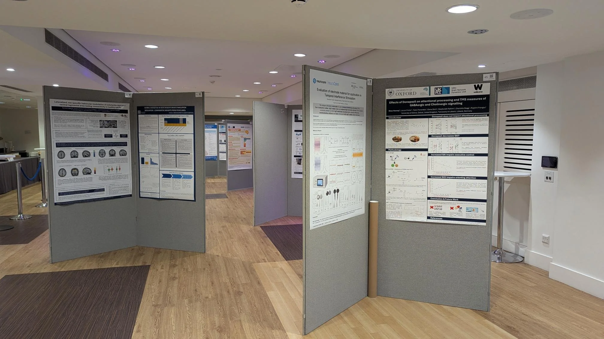
The image opposite provides an example of the kind of poster panel that will be used during the conference. Please not that there will be one poster displayed on each side of the board. The boards are 200cm tall and 100cm wide.
A display area of 120cm x 90cm (portrait layout A0) will be allocated for each poster. Please ensure that your poster does not exceed this size.
A numbered panel will be allocated for each poster, and the Brainbox Initiative staff will be on hand to advise you of your allocated number during the setup time for your session. Posters should be affixed to boards with pins or velcro, which will be provided on-site.
For further help and tips for presenting your poster at a conference, we recommend watching the recent webinar hosted by Dr Lindsay Santactroce.
The video features examples of what to share or withhold from a conference poster, design and layout ideas, tips and tricks for using PowerPoint for poster creation, examples of conference posters, and much more.
You can also view the previous posters archive for design inspiration.